About Me

Name: Caoimhe Quinn
School name: St Catherine's College, Armagh
Candidate number: 8488
Centre number: 71615
Unit code: G321

Preliminary Task: Using DTP and an image manipulation program to produce the front page of a new school/college magazine, featuring a photograph of a student in medium close-up plus some appropiately laid out text and a masthead. Additionally candidates must produce a mock up of the layout of the contents page to demonstrate their grasp of the program.

Main Task: The front page,contents and double page spread of a new music magazine


Friday, 27 February 2015

construction of Double page spread

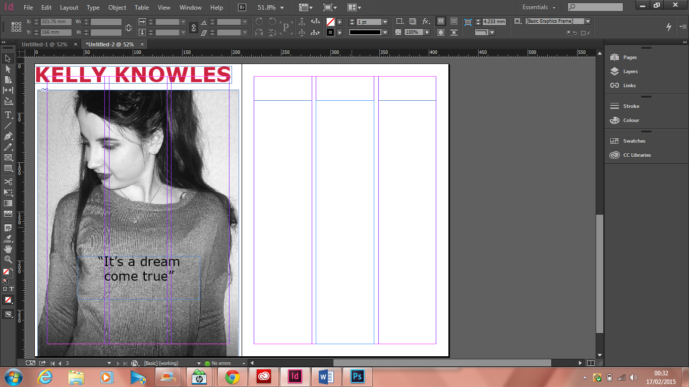
Firstly I have added in my mast head and the image that I am going to use for my double page spread. I out my masthead at the top so that it would be easy to see. Using the type tool I placed a pull quote from my article to entice readers to read on to the next page.


Next I had added in my next heading which just introduces Kelly. I did not want to put it on the first page as I thought that it would ruin the photo. 

Next using the type tool again I created a text box in the form of a column and to help me do this I used the columns that were already in place just to help me structure my magazine. 

Lastly a I added in the rest of my columns in pot my double page spread using the same step as before. I used three columns as it looks more professional and also it does not look messy as everything is in line. 

Thursday, 12 February 2015

Contents page construction

Firstly I opened In-design and started with a blank page. I used columns to help me structure my contents page to make it look professional.

 Next I added in a light blue half tone back ground to give the contents page a bit of color and I also added this background onto my front cover so I wanted to go onto my contents page with the same style.


 I then added in my masthead which is"CONTENTS" I made sure that it was big and noticeable so that people would recognise it.

After I added in my pictures and a magazine sticker for one article to just make it pop out of the page. 


I did not like how the photos where situated so I moved them around as it created more room to start writing my contents.

I then finished with adding in my features column and finished with writing my regulars column.
 

Tuesday, 3 February 2015

Magazine Front Cover


This is my second draft of my music magazine. I had to change the colours to make it a lot more colourful and to make it stand more. I also had to change the the masthead to make sure that it was not pixelated as that does not look professional. Lastly I had to add in a quote from the artist as I said I was doing an interview the quote from the interview could entice people to buy my magazine. 


Magazine Feedback


Front cover construction 

firstly I added in my background for my magazine. I used a light blue half tone background. At first I had no background but then in my feedback I was told as it was a pop magazine it needed more colour so that is why I added in the background.
I then added in my masthead which was POP CULTURE. I put it in capital letters so that it would stand out from the page and also people would notice it more.
thridly I added in my main photograph which is of the main feature artist. I done this to entice people to buy the magazine. By adding in my photo I was then able to start to structure the headlines around it.
In this image i have added in my first two feature headlines. One of them is about the feature artist and the other is about a competition which will entice people to buy the magazine. I also added in a  + to make the headline about the competition stand out.
As my main headline says that there is an exclusive interview i decided to put in a pull quote on my front cover which makes it more professional looking and lets the target audience see what will be inside.
Lastly I have added in my third cover line on the other side of the magazine to make sure that it looks professional.